In an age where data visualization has gained immense importance, understanding different types of charts and graphics is crucial. One such simple yet powerful tool used throughout various fields for data representation is the bar chart. Bar charts are a great way to visualize information in a straightforward yet effective way. In this article, we will dive deep into the world of bar charts, set forth to appreciate their versatility in data representation and learn how to efficiently create them.
Understanding the Basics of Bar Charts

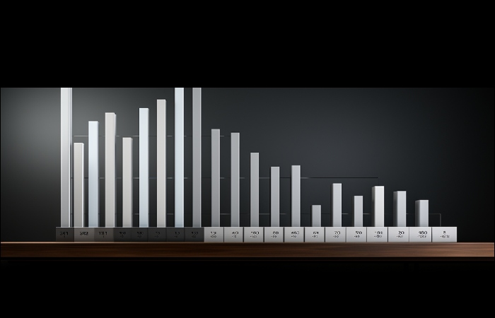
Bar charts are fundamental tools used to represent data graphically. They consist of rectangular bars where the length of each bar is proportional to the data values they represent. The longer the bar, the greater the value. Unlike pie charts which are best for showing proportions of a whole, bar charts are best when comparing discrete quantities.
The arrangement of bars can either be horizontally or vertically, depending upon the type of data and the preference of the data analyst. The primary axis displays distinct categories, and the secondary axis denotes the numerical scale. To manually add vertical or horizontal lines to help viewers better judge the heights of the bars, grids are often applied.
Before we delve deeper into the specifics, it is critical to understand the terminologies. The base of the bar is known as the x-axis (or horizontal axis), and the length of the bar is called the y-axis (or vertical axis).
Moreover, there is also the concept of clustered or grouped bar charts and stacked bar charts, both showing relationships between individual sub-items. For comprehensive bar chart examples and how they function, click the link to learn more.
The Versatility of Bar Charts in Data Representation
Bar charts are extremely flexible and versatile, capable of adapting to many different types of data. They are universally used across multiple sectors such as business, finance, health, education,
market research, and more due to their simplicity and ease of interpretation. Bar charts could be a handy tool for improving reports and presentations, making them more visually appealing and understandable.
Also, they are effectively used for comparing information collected over time, making them ideal for displaying trends or changes in data over a period. This attribute makes bar charts extremely useful in fields like market analysis, sales forecasting, or statistical research.
The Process of Creating an Effective Bar Chart
Creating a bar chart might seem simple; however, a well-structured and organized chart can make all the difference. Begin by identifying the data you have and how to best categorize it. An important design consideration here is that the bars should be proportional to the data that they represent.
Each bar in the chart should have a distinct color or hue to differentiate it from others. This color variation is particularly important in multi-set or grouped bar charts where the contrast between bars is crucial for easy comparison.
Always remember to label your axes correctly. The labels should correctly represent what the axes depict. All too often, charts are rendered useless because the axes are not correctly or clearly labeled.
Lastly, providing a title for the chart and a legend (if necessary) is also essential. A good title directly reflects the data and the purpose of the chart. The legend must provide clear and concise explanations of the variables in the chart.
Common Mistakes in Drawing Bar Charts and How to Avoid Them
The primary purpose of a chart of any kind is to aid interpretation and understanding of the data. However, if it fails to do so, its existence becomes futile. Some of the most common bar chart errors include using too many categories, not starting the y-axis at zero, or creating disproportionate bars.
Having too many categories in a bar chart can make it messy and unreadable. It is crucial to keep your categories concise and clear for a cleaner look and easier understanding. If there is a lot of data to process, consider creating multiple bar charts or utilizing a different chart type altogether.
Another common error is not starting the y-axis from zero. This can misleadingly exaggerate the differences between bars. To avoid creating false impressions about the data proportion, analysts should always start the y-axis at zero.
Altogether, understanding bar charts and their numerous applications requires recognizing their basic structure, appreciating their adaptability, learning the correct process of creation, and being aware of common mistakes.